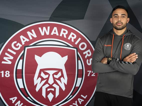
Talking RL: My issue wasn't with Wigan Warriors' new badge... it was with losing the old one


Yes, I'm talking about the new club badge, which was revealed last night.
Executive director Kris Radlinski said just before its release that they may upset some people.
He was certainly right about that.
Advertisement
Hide AdAdvertisement
Hide AdFans were quick to comment on social media, with many criticising the move and pleading with the club to change its mind.
Some liked it. Some were indifferent. Some hated it.
Some compared it to Costa's logo.
Me? I didn't find the new badge offensive - I just didn't want to give up the old crest.
I've got an emotional connection to that big thing, with the two yellow lions and the shield with the castle. Ancient and loyal, and all that. I know it's only a logo, but it means something.
I see it, and it evokes many, many happy memories.
Just as it does for many, many others.
Including, I'm sure, Radlinski.
So why change it? I've spoken to officials at the club, and the designers, and people far smarter than me on these issues, and there are a few reasons.
Advertisement
Hide AdAdvertisement
Hide AdWhen Wigan's crest is placed alongside the other Super League club logos, it looks out of place. It doesn't sit with the simplicity of, say, the Toronto 'T' or the St Helens 'V' or the Super League logo itself.
All of those logos are sizable, too. Meaning they can go on, say, a Twitter handle or a TV score graphic or be seen really, really small on a mobile phone screen and they are still clear.
If you look, other successful clubs do this well - Liverpool, for example, will, at the right time, just use the liverbird part of its logo, rather than the entire badge.
In fact, all major companies have a logo they can use small to help them be recognised - even stand out - in a crowded digital world.
Advertisement
Hide AdAdvertisement
Hide AdWigan couldn't do that with the old crest; it was too complex and complicated. Once it was shrunk down, it became an undecipherable blur on a small screen. And, commercially, they say it limited them. It cost a lot to produce the logo on clothing, because of the stitching, and they felt an old-fashioned badge didn't sit well on, say, a line of modern leisurewear.
My preference, for what it's worth, would have been to simplify the crest; maybe lose everything from the top quarter (until I studied it, I never actually realised it was a king with a lion on its lap) but retain the two yellow lions, the shield with the castle on it, the ancient and loyal.
I could have accepted that far more easily.
Wigan, clearly, felt that if they were going to do it, they had the chance to be bold and daring. And create a logo which links to their name (a castle on a shield doesn't scream 'Warriors' as much as an actual face of a warrior).
In my view, a problem for the club is their 'Warriors' tag has never been as accepted as, say, the Bulls at Bradford, Broncos at London, even Wolves at Warrington and Rhinos at Leeds.
Advertisement
Hide AdAdvertisement
Hide AdBut like it or not, the club has decided to put a warrior at the heart of its badge. When I was told that was the plan, I feared the worst.
I expected a cartoony warrior like Max the mascot, or something which looked like the Transformers logo. Instead, they created what we saw last night.
For what it's worth, I actually think the two Ws which form the beard is quite smart. I don't really buy the story about the 'eyes of a Wiganer' but I do like the cherry and white hoops behind the shield and I'm glad the 'ancient and loyal' has been kept.
As I said earlier - and I may be in the minority here - the new badge isn't the issue for me, it's the loss of the old one. It means something to me (and I'm glad it isn't being retired completely).
But I do understand the reasons for the change.
Advertisement
Hide AdAdvertisement
Hide AdAnd whether you like the new badge or not, it's encouraging that at a time when many clubs seem to be clinging on for dear life, when many within rugby league are waiting and praying they get a generous new Sky deal, Wigan are moving forward. This move suggests they see a bright future.
A bright future, with a whole new look.
Read unlimited Wigan Athletic and Wigan Warriors stories for less than 70p a week by subscribing to our sports package here