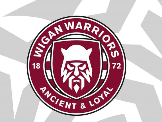
Wigan Warriors reveal new badge


They revealed the artwork tonight and will replace the existing crest on the shirts - with the hope it will help attract a younger audience.
The cherry-coloured circular design includes the team name, 1872 - the year the club was formed - and the 'ancient and loyal' motto.
Advertisement
Hide AdAdvertisement
Hide AdIt also keeps the shield from the current logo, but with the outline of a warrior depicted in the centre, with two Ws forming part of the beard and "noticeably piercing eyes".
Warriors' executive director Kris Radlinski said the idea came from an audit of Super League clubs.
"The main feedback we got was that our crest was outdated, old fashioned and probably not recognisable," he said. "This reaffirmed what we had been thinking for a while – that we needed to do something with our badge.
“We’ve made no secret over the past few years that we need to attract a younger crowd. We do have an ageing fanbase, so we need to look at different ways in which we can engage and inspire the next generation in this hyper-connected world we are now living in.
Advertisement
Hide AdAdvertisement
Hide Ad“My chairman, Ian Lenagan, and I, who between us, have got around 120 years’ worth of invested commitment and emotion in the club, feel as though now is the right time to do it. We know that fans are consuming sports differently, so we took a look at the current sporting landscape to see what’s working for some of the biggest clubs in the world and fed that into the process.
"I like to think there is a light at the end of the tunnel and that we are coming out the other side. I almost see this as a beacon of hope. We are going to come out on the other side of this strong and this badge is going to guide us. We all know just how important 2021 is from a broadcast perspective and we would like to think that this modern way of working will show that we are not remaining static. We are proactively looking at ways to improve.
“All we ask is that fans approach this with an open mind and understand that we are doing it to make us better and improve everything we offer to them.
“I am confident we are doing this for the right reasons, which is to make this rugby league club a better club."
Advertisement
Hide AdAdvertisement
Hide AdWigan say many fans were consulted before agreeing the new crest, which has been created by design agency Nomad, which redesigned the Premier League logo.
The existing logo has been used for decades - save for a season in the late-90s - and won't be completely retired, with the club planning to use it on heritage occasions.
But from now on, their shirts, training tops and club branding will incorporate the new artwork.
Radlinski added: "“The old crest will always be there in our heritage and will be visible in relevant circumstances, helping to lead us into the brave new world by reminding us of where we come from and where we want to be heading. We’ve had so many players who have worn that crest and we respect that, and we have to never ever forget that. But we also have to look forward. This is us looking forward and saying this has to happen to keep us up to speed with the modern world, modern sport and modern broadcast and digital strategy."
Read unlimited Wigan Athletic and Wigan Warriors stories for less than 70p a week by subscribing to our sports package here